0%

 Figma
Figma Notion
 ChatGPT
What I shipped
Three shifts that changed the upgrade experience.
CTA system
Three upgrade surfaces (collapsible menu, static buttons, popup cards) that don’t interrupt workflow
Pricing architecture
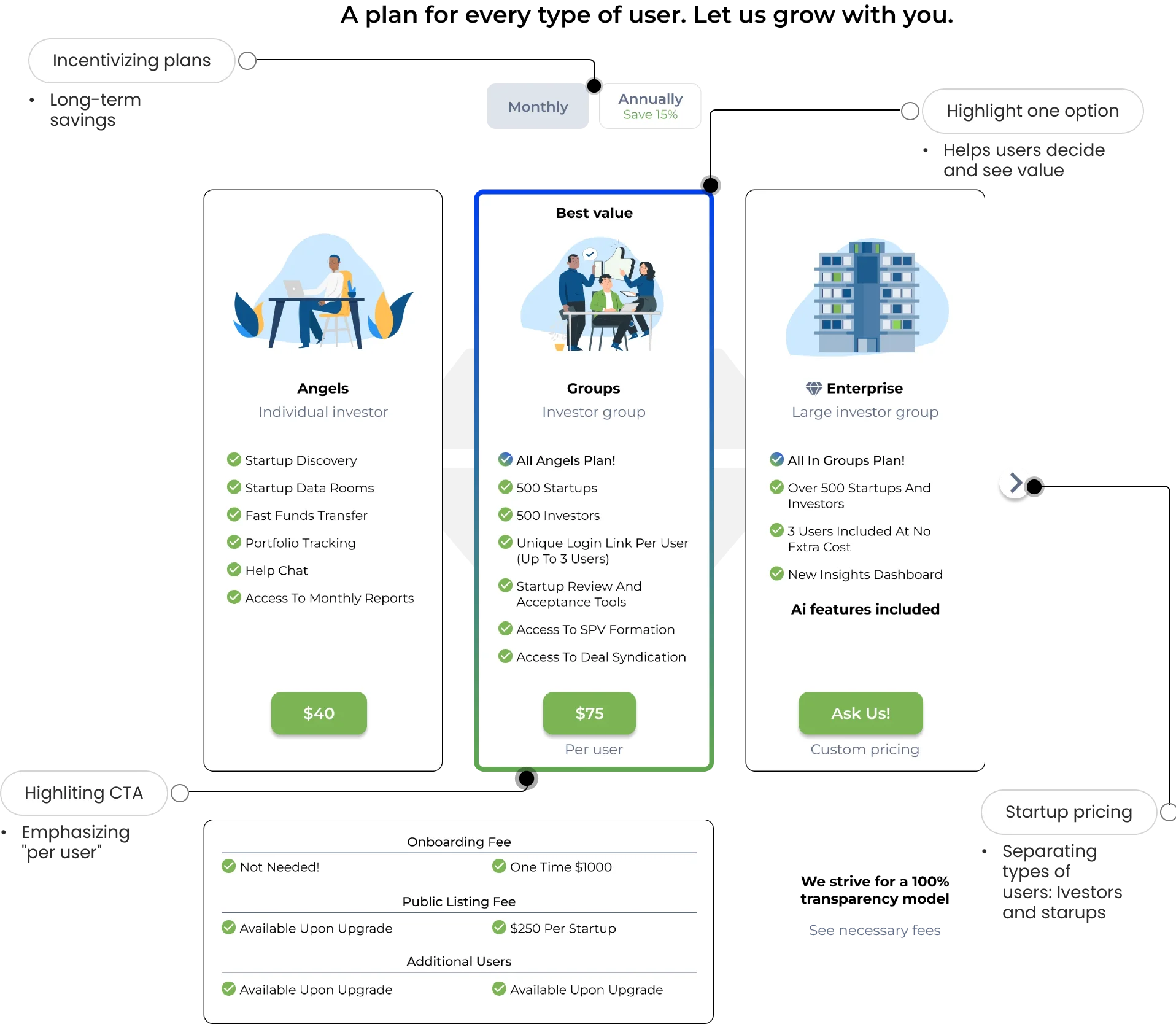
Two separate pricing paths for investors and startups, each with tailored features
Tiered dashboard
A free tier worth using, a premium tier worth paying for, with natural upgrade triggers
Impact
Fewer sales calls. More upgrades. A pricing surface that does its own selling.
20% increase in upgrade rates through improved financial dashboard UI
~50% reduction in negative feedback by redesigning navigation for embedded experiences
~50% decrease in required sales calls via self-serve monetization design
Projected 5% client-base growth within 6 months of launch
“I just upgraded myself. It took like 20 seconds. Last time I had to email support and wait three days.”, Beta user, first week after launch
The problem
I had ten weeks to design one.
Sales calls for every upgrade
Confusing pricing structure
Free tier too limited to sell upgrades
“I didn’t even know there were paid plans. I’ve been on the same tier since I signed up.”, User during discovery interviews
“Pricing affects the bottom line nearly 4x over acquisition. Monetization has a 12.7% impact on the bottom line compared to 3.32% from customer acquisition.”
This reframed the project from “UI cleanup” to a business-critical decision. Pricing surface was the lever, not polish.
Upgrade flow
Before diving into individual surfaces, it’s worth seeing how the pieces connect. The upgrade flow has three entry points, a scrollable sales funnel, feature-specific popups, and situational upgrade prompts, all converging into a single checkout. Users can start from anywhere and finish in under a minute.
What this shows
How all three CTA paths converge into a single checkout
Why it matters
Multiple entry points, one consistent upgrade experience
The result
Users can enter from any surface and complete in under a minute
CTA strategy
Three upgrade surfaces that don’t interrupt the workflow.
Users who wanted to upgrade hit a wall, a generic "Contact Sales" link and days of waiting.
Systems with combined CTA methods outperform single-method approaches, and the most effective pattern bridges the gap between the CTA and the conversion point with the right information at the right time.
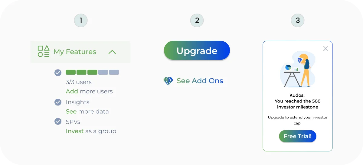
What this shows
Three CTA types layered by user intent, glance, browse, and act
Why it matters
Each surface serves a different moment without overwhelming the interface
The result
Self-serve upgrades that don’t interrupt the user’s flow
Education
Fundr’s platform centers on Special Purpose Vehicles, the investment structure that lets investors pool capital into a single startup. Most users didn’t understand what an SPV was or how capital flowed through it. Upgrade prompts had no context, users couldn’t value what they couldn’t visualize.
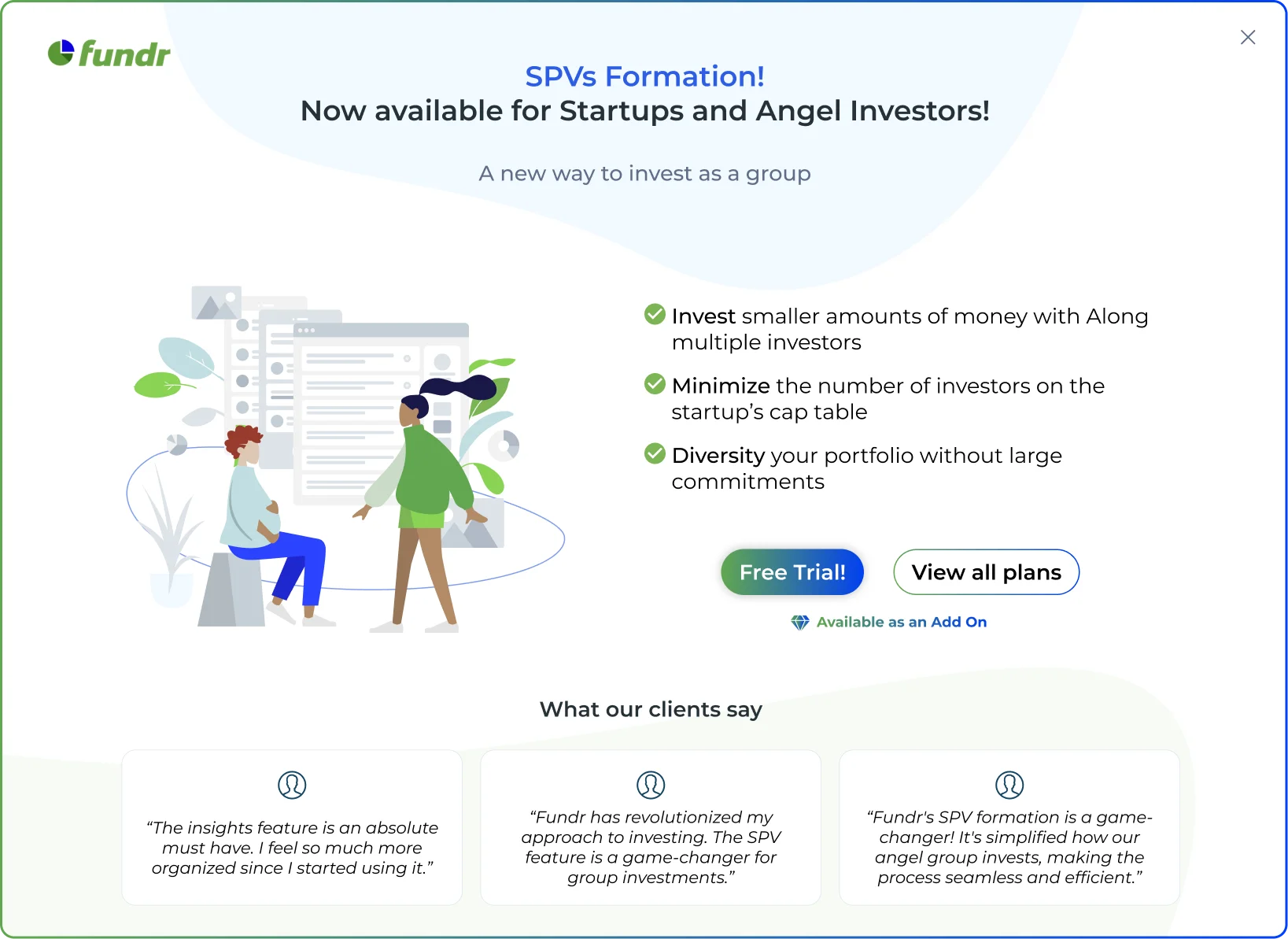
What this shows
The SPV structure, investors, capital flow, and the startup relationship
Why it matters
Users understand the core mechanism before they consider paying for premium access
The result
Upgrade prompts now carry context, users know exactly what they’re unlocking
Pricing
Confusing tiers, made deliberate.
“Wait, I can actually see what each plan costs without guessing. That’s… clear.”, User testing the pricing page prototype
Decision
The CEO wanted one unified pricing page, simplicity was a core value, and two paths risked surface complexity. I mapped both user journeys, showed where investor and startup needs diverged, and the data won. We shipped two pricing paths.
Dashboard
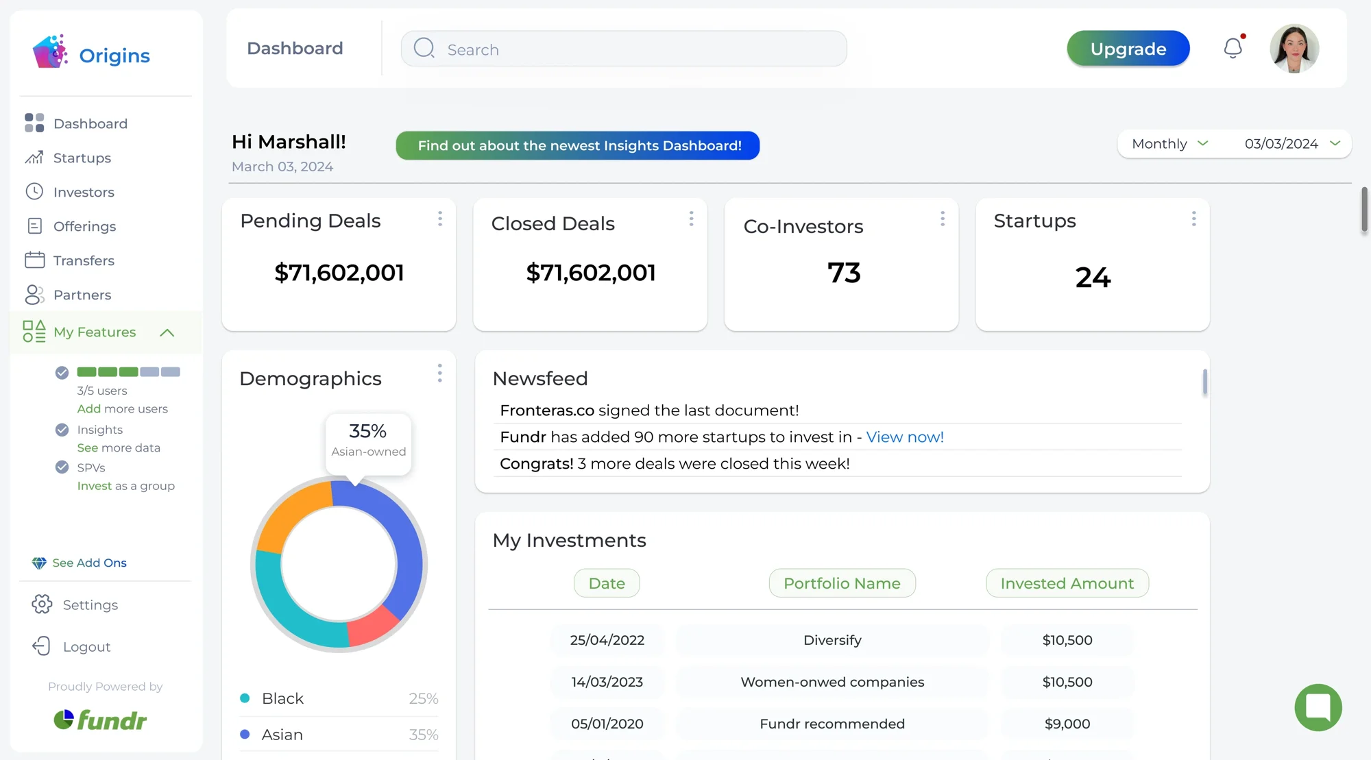
A free tier worth using. A premium tier worth paying for.
The free tier was a demo, not a product, so limited that users couldn’t evaluate whether Fundr was right for them.
Basic tier
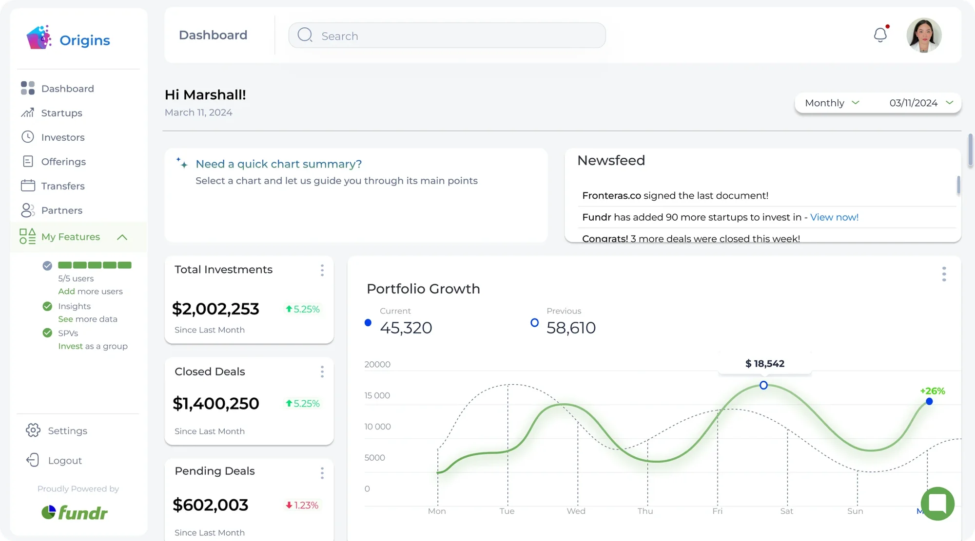
Premium tier
What this shows
Side-by-side comparison of free vs paid dashboard experience
Why it matters
Users see exactly what they gain, not just what they’re missing
Reflection
Hindsight and the next version.
Push for analytics instrumentation before shipping. We had to estimate upgrade rate impact instead of measuring it directly, which made iteration harder and the second cycle slower than it needed to be.
Run a larger A/B test on the 3-CTA hierarchy. The collapsible menu and popup cards tested well individually, but a cleaner 2-variant test would have given stronger signal on which surface drives the most conversions.
Involve engineering earlier in the pricing IA. Separating investor and startup billing had back-end implications we didn’t surface until implementation, which compressed the engineering timeline.
Overview
A high-level walkthrough of the Fundr upgrade flow, a deeper dive into specific decisions and trade-offs is available during a portfolio interview.
I’ll walk you through the pricing redesign, the CTA tests, and the calls we cut.
More case studies