0%

 Figma
Figma V0 by Vercel
 ChatGPT
 Perplexity
 Loom
LoomWhat I shipped
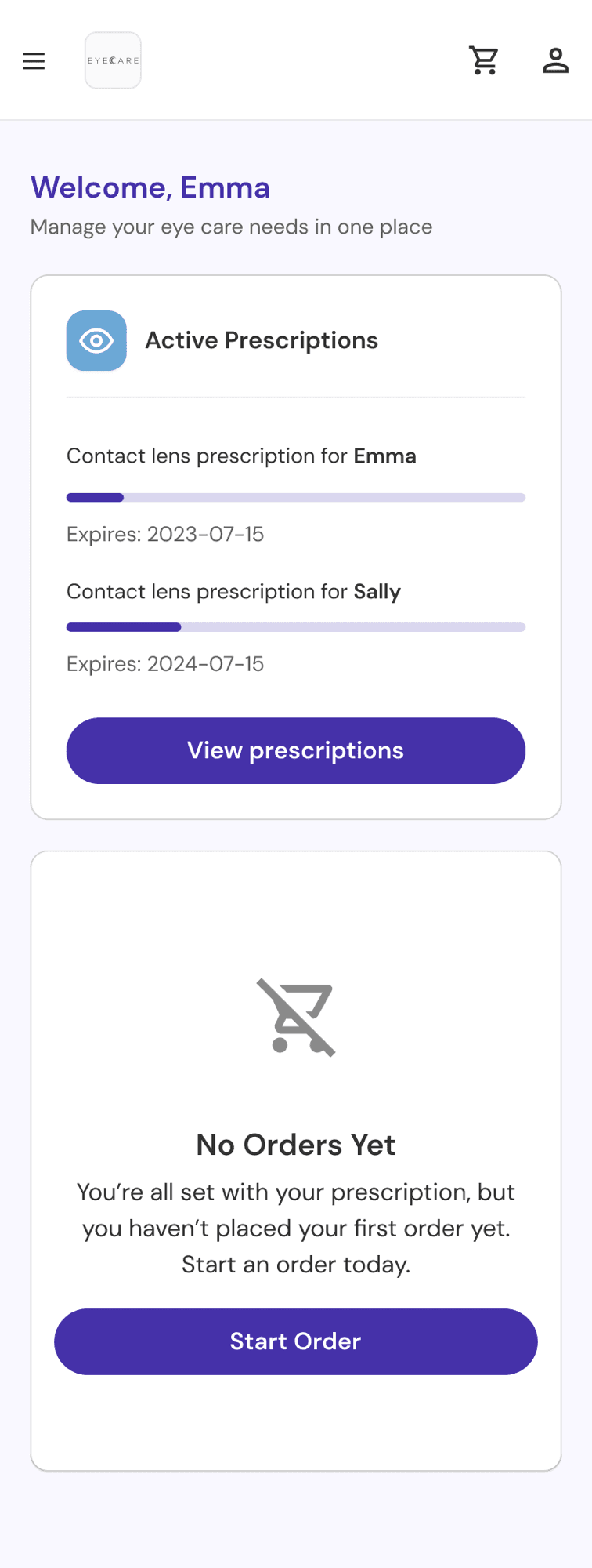
Prescription dashboard with color-coded badges, supply bars, and 3-state validity logic (valid, expiring, expired).
Real-time staff-patient sync: create a checkout, patient notified. Patient changes quantity, staff sees it live.
Skeleton loading, toast confirmations, and 30-second error retry keep trust intact.
Named sub-patient profiles with their own prescription cards and order history.
No multi-account architecture needed, caregivers manage the whole household without juggling logins.
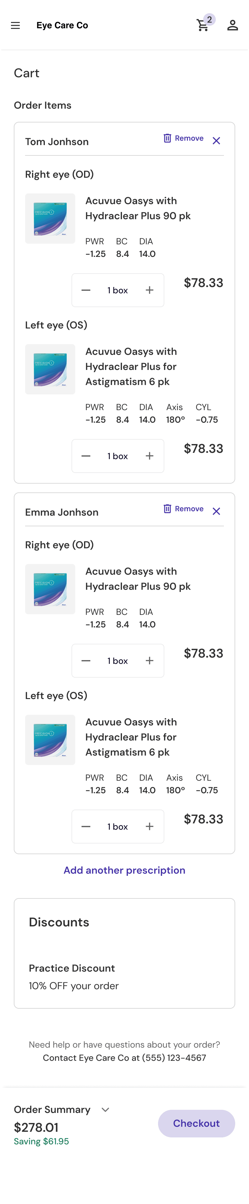
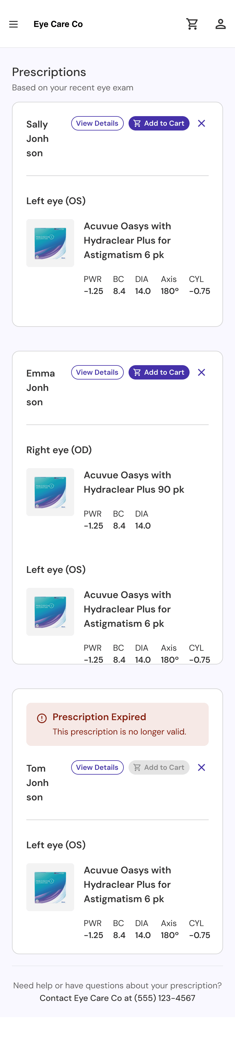
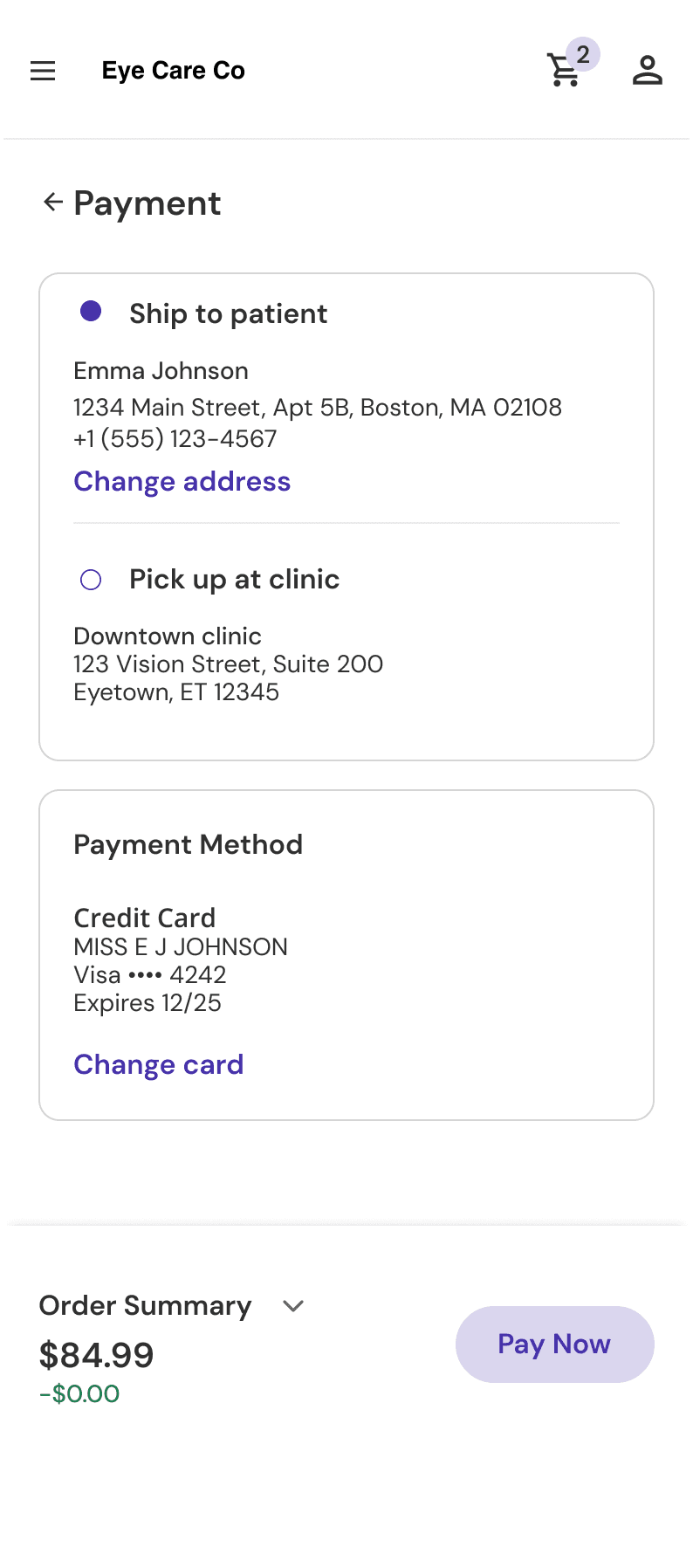
Patient mobile app: dashboard with prescription status, prescription management, and checkout
Impact
iDoc platform
Design outcomes (projected)
Delivered a month early. Live, in patients’ hands. (Analytics instrumentation shipped post-V1, so these are projections based on pilot clinic data.)
Delivered 1 month early, live at idocbridge.com
Target: 60%+ of pilot clinic patients complete first purchase in-app (vs. 0% previously)
Target: 40% reduction in staff checkout creation time
Target: 80%+ of first-time users complete checkout independently
The problem
The largest US alliance of independent eye doctors needed a HIPAA-compliant, prescription-aware e-commerce system: doctor portal + patient mobile app. Their competitor had over a decade head start. We delivered V1 in six months. I owned the patient app design process.
A decade-old market leader with a massive head start
HIPAA-compliant prescription verification at scale
Patients with no visibility into their own prescription data
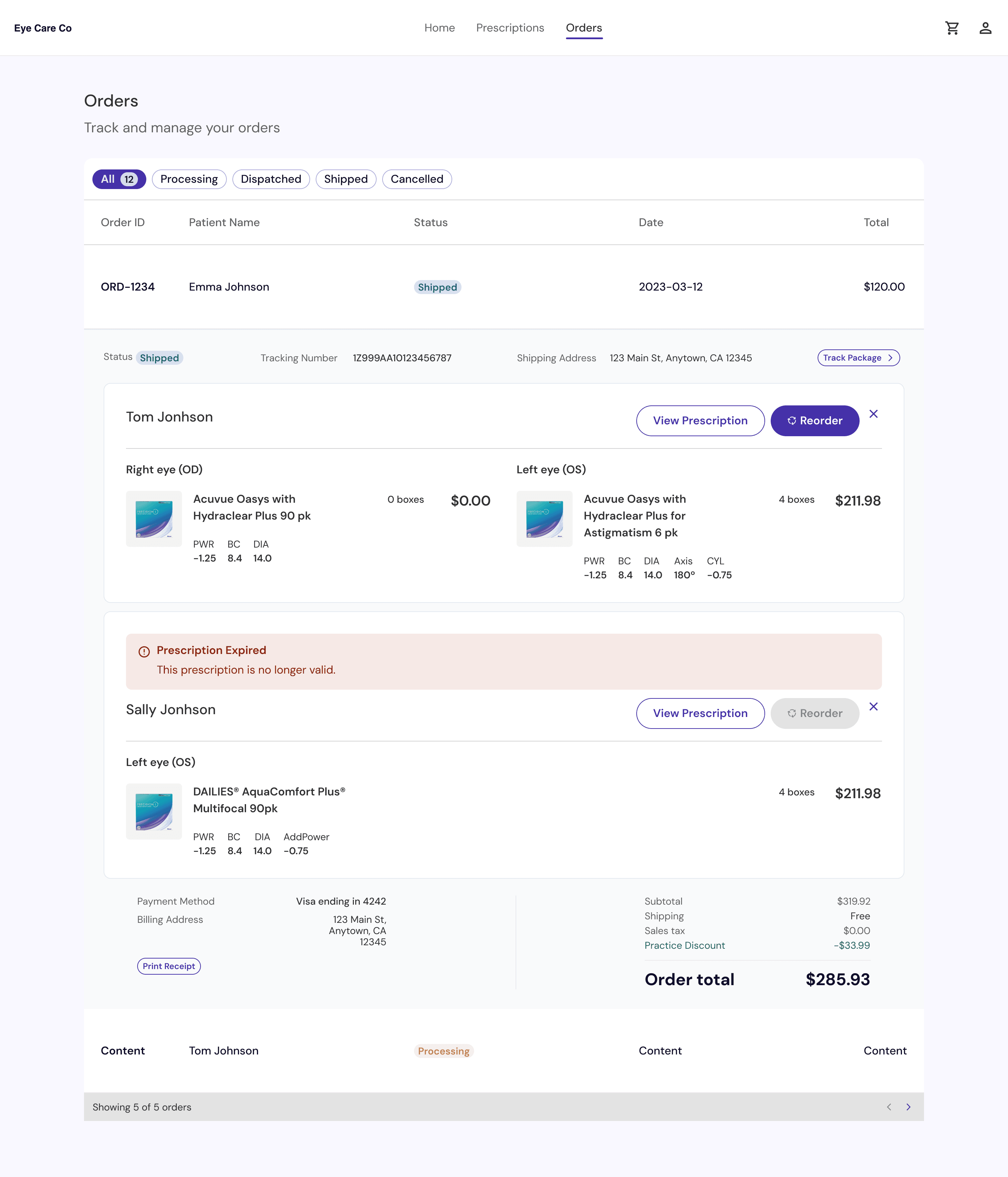
The staff-facing order interface iDoc relied on before the patient app
Research
The VP of Product ran moderated testing sessions with practice staff and patients. One front-desk coordinator (who placed orders daily) became the clearest signal for what needed to change.
“Hallelujah.”
“That was amazing. Fantastic.”
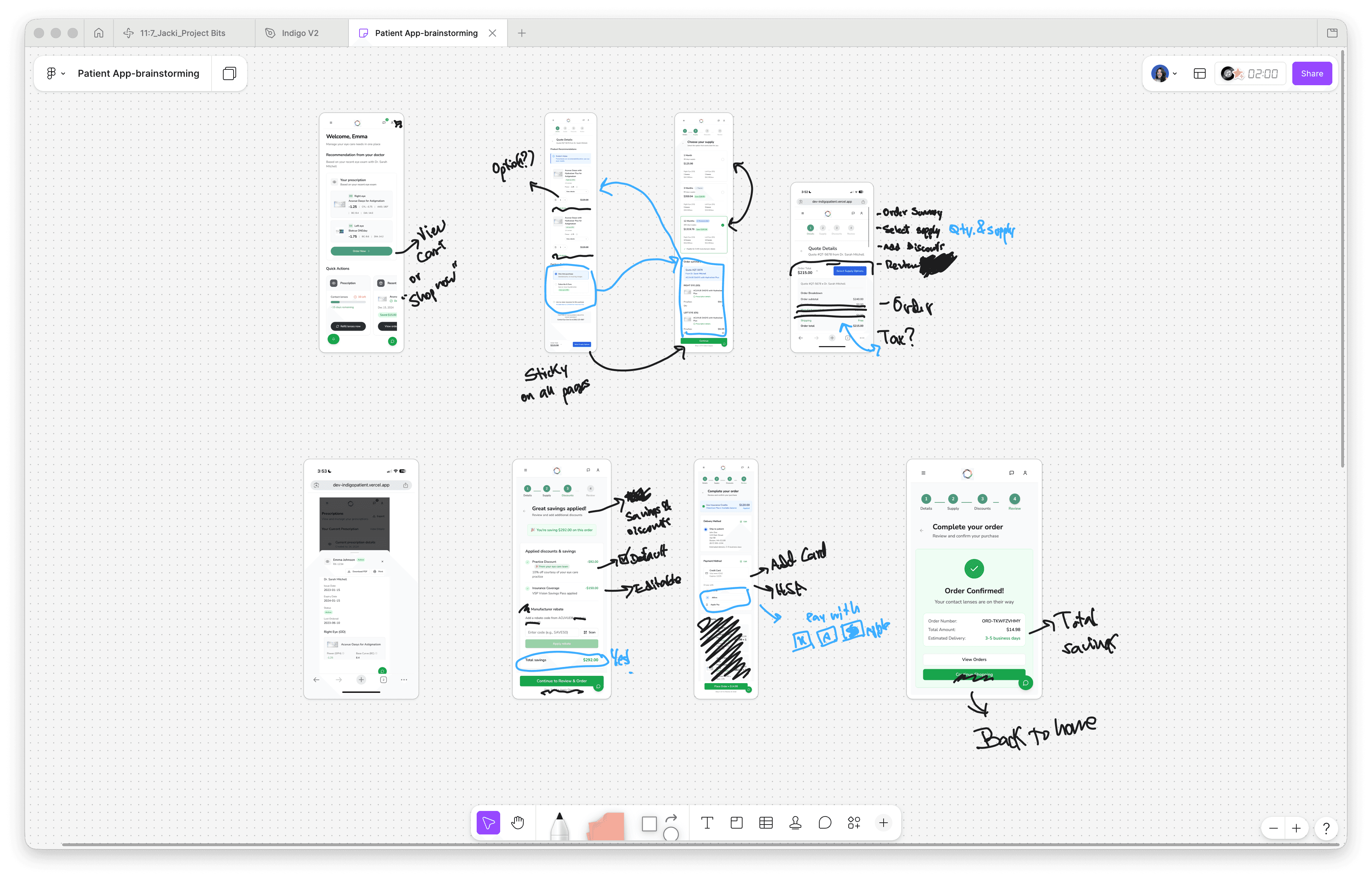
Early FigJam brainstorming, working through the complex checkout flow that had to sync with the doctor’s desktop app
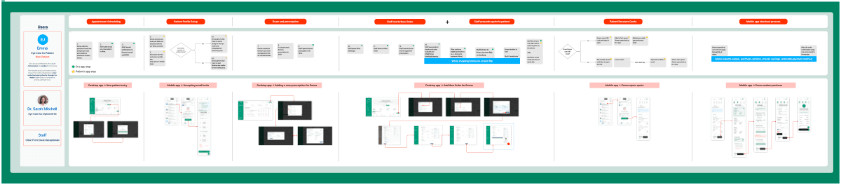
Journey map tracing the full experience from staff profile creation through patient checkout. View full PDF
Constraint
When V0 credits ran out, I built a personal prototyping environment (Project Bits, using Figma Make) to test five-plus checkout flows without burning budget. Stretched $5 across12+ feature iterations. The team only realized once decisions were already faster.
“Without Vercel, we wouldn't have had alignment at the leadership level to have confidence to say V1 is going to be good.”
Project Bits, the private prototyping environment that stretched $5 across 12+ iterations
Challenge
Two weeks before final designs, an acquisition brought a completely new brand identity and style guide.
I mapped every updated design token across every patient screen (colors, typography, components) and tested across every state: loading, error, empty, success. Worked with the design system owner to keep both apps visually cohesive through the transition.
The original timeline held. No delay to dev handoff. The final designs were better for it.
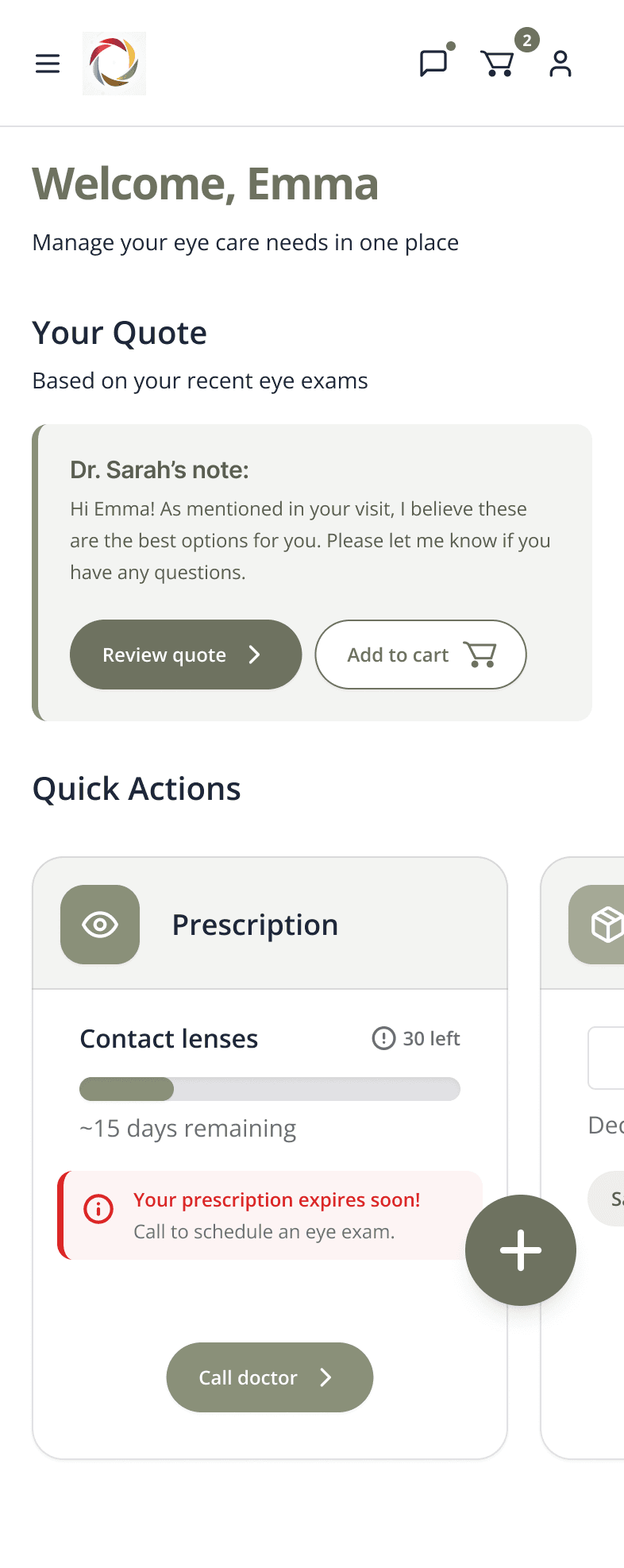
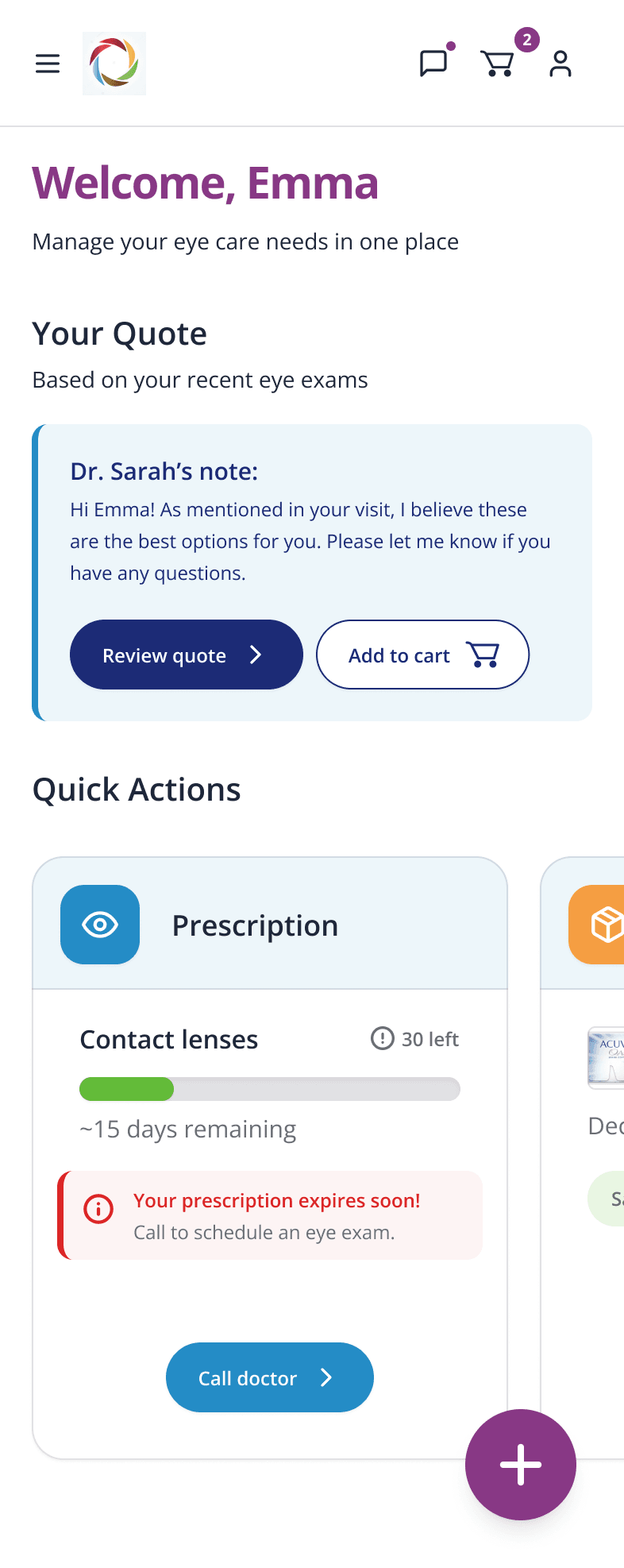
From color system to color system: three brand identities in five months
The product name changed over five times throughout the process, from Fern, to Olive, to Indigo, and finally to Bridge.
Reflection
My first healthcare product — built under constraints that could have slowed everything down:
What I’d do differently: push for analytics access earlier. We shipped without instrumentation, so I can’t measure what I designed. A gap I’m carrying into the next project.
What worked: the prototype-first approach. By the time requirements were written, the team had already reacted to something real. That collapsed weeks of alignment into days.
Visit the live product, or get in touch and I’ll talk you through the design decisions, including the ones that didn’t make it to ship.
More case studies